The problem with touchscreen kiosks accessibility in public spaces
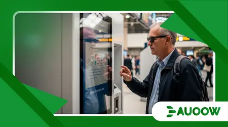
The problem with touchscreen kiosks accessibility often begins with a person standing in the middle of a bustling train station, squinting at a smooth, unresponsive sheet of glass.
Imagine a traveler who is blind or has low vision, or perhaps an elderly veteran with a slight hand tremor, trying to navigate a sleek, “smart” ticketing pillar in a crowded terminal.
To the designer in a climate-controlled office, that glowing rectangle represents efficiency and the pinnacle of modern urban life.
To the person standing before it, however, it is a frictionless, featureless barrier a silent wall that offers no tactile cues, no audible guidance, and no way to complete a basic transaction without public embarrassment or a loss of independence.
What follows is an exploration of the structural choices shaping our public interfaces:
- The shift from tactile hardware to digital-only interfaces.
- The disconnect between industrial design and disability legislation.
- How “Smart Cities” inadvertently build new barriers.
- The economic and social cost of digital exclusion.
- Practical paths toward universal design in public hardware.
Why did we swap physical buttons for inaccessible glass?
There was a time, not so long ago, when interacting with a public machine involved a predictable set of physical sensations.
You could feel the raised edges of a keypad, the distinct “click” of a confirmed selection, and the Braille indicators that guided a finger to the correct slot.
As we moved toward the mid-2020s, the aesthetic of the “black mirror” took over.
The problem with touchscreen kiosks accessibility stems from a design philosophy that prioritizes visual minimalism over functional diversity.
Developers favored glass because it is cheaper to maintain and easier to clean than mechanical buttons, but in doing so, they stripped away the “affordances” the physical clues that allow a diverse range of humans to interact with the world.
When we observe this shift closely, the pattern reveals a preference for the “standard” user someone with 20/20 vision, steady motor control, and a specific standing height.
When a physical button is replaced by a flat pixel, the interface becomes a “visual-only” medium.
For those who cannot see those pixels or who struggle to touch a precise, untextured point in space, the machine might as well be a brick.
This isn’t just a technological oversight; it is a choice to prioritize the sleekness of the object over the dignity of the person using it.
++ How accessible EV charging stations lag behind urban demand
Is the “Smart City” movement making us less inclusive?

The rush to modernize urban centers installing digital wayfinding pillars, self-service food lockers, and automated health check-in stations often happens faster than the update of accessibility regulations.
We are currently witnessing a period where the problem with touchscreen kiosks accessibility is being “baked into” the very infrastructure of our cities.
There is a common assumption among urban planners that because a kiosk is “new,” it must be “better.” However, innovation without inclusive design is simply a new way of excluding people.
What rarely enters the debate is the fact that many of these kiosks are managed by private vendors who operate under a “check-the-box” mentality regarding the Americans with Disabilities Act (ADA) or equivalent global standards.
They might include a headphone jack, but if that jack is located four feet off the ground or tucked behind a metal shroud where a person with limited reach cannot find it, the “solution” is purely performative.
When we look at the software, the issues compound.
Small hit-boxes, lack of high-contrast modes, and time-out screens that disappear too quickly create a high-stress environment that punishes anyone who doesn’t move with a specific, “optimized” speed.
Also read: Ride-Sharing Accessibility: Are Uber and Lyft Meeting Promises?
How do decisions made a decade ago affect your commute today?
The lag between legislation and implementation is a significant hurdle. Many kiosks being installed today were designed and contracted years ago.
If the procurement process didn’t explicitly demand “meaningful access” which goes beyond a simple audio-out port we end up with a legacy of barriers that will take another decade to replace.
In my reading of this scenario, we are seeing a repeat of the “curb cut” struggle, but this time, the barrier is digital and invisible.
Why is “Digital-First” becoming “Digital-Only”?
There is a subtle but dangerous trend where physical alternatives to kiosks are being removed entirely to save on labor costs.
Think of the airport where there are no longer any human-staffed check-in counters, or the fast-food restaurant where you are pointed toward a glowing pillar the moment you walk in.
The problem with touchscreen kiosks accessibility becomes an emergency when there is no “Plan B.”
For a person with a cognitive disability who finds a complex, flickering screen overwhelming, the absence of a human fallback isn’t just an inconvenience it is an end to their participation in that service.
The analysis most honest about our current trajectory suggests that we are building a “two-tier” society.
One tier moves through the world seamlessly, aided by their devices and their physical alignment with standard design.
The other tier is forced to wait for assistance, ask strangers for help with private information (like banking or health data), or simply opt out of public life.
This “forced dependence” is a direct contradiction to the goals of disability rights movements, which have spent decades fighting for the right to self-sufficiency.
Read more: The Rise of Electric Wheelchair Bikes for Urban Commuting
Imagine a skilled worker facing invisible barriers.
Imagine a software engineer who uses a wheelchair, traveling to a tech conference. He arrives at a modern hotel that has replaced the front desk with a row of sleek, waist-high kiosks.
He finds that he cannot position his chair close enough to the screen because the base of the kiosk is too bulky.
Even if he could, the glare from the overhead lights on the flat glass makes the screen unreadable from his seated angle.
He is forced to wait in the lobby until a staff member happens to pass by, turning what should have been a 30-second check-in into a 20-minute exercise in frustration.
This scenario isn’t a failure of technology; it is a failure of empathy in the design phase.
What actually changed after the first wave of kiosks?
Initially, the conversation was focused almost entirely on height ensuring a wheelchair user could reach the screen.
While physical reach remains a struggle, the second wave of concerns has shifted toward the “blind glass” problem.
We have seen some progress: some kiosks now include “Screen Reader” technology and tactile “nubs” on certain ports.
However, the implementation is inconsistent. A traveler might find a perfectly accessible kiosk in London but be completely stuck in New York, even if the machines look identical.
| Feature | The “Visual-Only” Standard | The Inclusive Standard | Impact on User |
| Input Method | Smooth Glass Only | Tactile Keypad / Voice Command | Allows non-visual navigation |
| Audio | Silent / No Output | Text-to-Speech via Jack | Private access for blind users |
| Screen Height | Fixed (High) | Adjustable or Lowered | Reachable for seated users |
| Software | Small, Fixed Text | High Contrast / Scalable Text | Accessible for low-vision users |
| Timeout Logic | Strict / Fast | Extended / Prompted | Reduces anxiety for cognitive disabilities |
How can we bridge the gap between design and dignity?
The solution isn’t to abandon kiosks, but to demand a “Universal Design” approach from the start. This means involving people with lived experience in the prototyping phase, not as an afterthought.
There are good reasons to question the current approach of “adding accessibility features later.”
If the core architecture of the kiosk both the hardware shell and the software code isn’t built with the problem with touchscreen kiosks accessibility in mind, the result will always be clunky and prone to failure.
One detail structural designers often ignore is the environmental context.
A kiosk in a quiet library needs different accessibility features than one in a roaring subway station.
Tactile feedback through vibrations (haptics) or “gesture-based” navigation that doesn’t require precise touching of small pixels could revolutionize how we interact with these machines.
We need to move toward a world where a kiosk recognizes a user’s pre-set accessibility preferences via their smartphone, automatically adjusting the interface height or turning on high-contrast mode before the user even reaches the screen.
The Future of Public Interaction
We are at a crossroads in the development of our shared spaces.
The problem with touchscreen kiosks accessibility is a signal of a much larger tension between the desire for automated efficiency and the human need for inclusion.
If we continue to build cities that assume a “perfectly able” body as the default, we are essentially designing an expiration date for our own independence.
Society thrives when its infrastructure is “low-friction” for everyone, not just for the few. The sleek glass pillars of our 2026 cities should be gateways, not gatekeepers.
By demanding that technology respects the vast spectrum of human ability, we ensure that the “Smart City” is actually a wise one one that values the presence and participation of every citizen.
It is time to look past the glow of the screen and see the person standing in front of it, waiting to be included.
Have you encountered a digital barrier in your local city? Share your experience in the comments below.
Frequently Asked Questions
Why can’t I just use my phone instead of the public kiosk?
While mobile apps are a great workaround, not everyone has a smartphone, a data plan, or a charged battery.
Public services must remain accessible to everyone, regardless of their personal technology ownership. Relying on “bring your own device” as a solution for accessibility is a form of social exclusion.
Isn’t it expensive to add all these features to every machine?
Retrofitting is expensive; designing inclusively from the start is not.
When kiosks are accessible, they are also easier for everyone to use including parents with strollers, people carrying heavy luggage, or those with temporary injuries.
This is known as the “curb-cut effect,” where accessibility benefits the entire population.
Do current laws like the ADA cover digital kiosks?
Yes, but the specific technical standards for kiosks have been in a state of flux.
While the general requirement for “effective communication” and “equal access” applies, many vendors exploit the lack of specific, updated hardware mandates.
Legal pressure is increasing to ensure kiosks meet the same level of accessibility as websites.
What is the best way for a business to make their kiosks accessible?
The most effective method is to follow the Web Content Accessibility Guidelines (WCAG) for the software and the ADA Standards for Accessible Design for the hardware.
Ideally, the machine should offer multiple ways to perform the same task visual, audible, and tactile.
Can voice control solve the accessibility problem?
Voice control is a powerful tool, but it isn’t a silver bullet.
Public spaces are often too noisy for reliable voice recognition, and users may not want to speak private information, like a PIN or a destination, out loud. It should be one of many options, not the only one.